Effigies of ladies of the 13th or very early 14th centuries tended to all be very similarly dressed with a flowing gown and simple head covering, often with a wimple. The fact they they were depicted as large tomb effigies at all was sufficient testimony to their status. Most tombs of this vintage have been knocked around a bit, moved, and lost their colouring and gilding. They are ghosts of their former selves. The two ladies above are from Tideswell in Derbyshire.

It has been said that fashion was invented in the early 14th century, with clothing styles for men and women undergoing rapid change. Having the very latest in fashions was an insignia of not only wealth, but status and influence. If the missus was dressed in the latest crazy headgear and sleeves with a million buttons, then she was not only rich, she undoubtedly had someone to help her get dressed in the morning, like this lady from Bothamsall in Nottinghamshire.

In the days of sumptuary laws, if she was togged out in imported brocade, she was guaranteed to be of a certain status in the social hierarchy. The above is a replica of the brass to Margaret Peyton (1484) in Isleham, Cambridgeshire. These fashions changed so rapidly that the makers of effigies, whether brass or sculpted stone, were constantly updating their designs to keep up. Where the tomb has an inscription it is possible to create a chronology for these fashion changes but in the absence of one, I have doubts about identifying the tomb owner by cross referencing the date of death with the fashion design. It may date the effigy accurately, but it would depend on whether it was made before death (It's been done.), immediately after or some years after.

Here is a bit of gratuitous female bling from Methley, Yorkshire, because bling looks so good in alabaster. Amazing hat.

Something similar happened over the same period with the depiction of knights. The example above is an early 14th century effigy from West Tanfield, Yorkshire, turned out in chain mail. The evolution to plate armour and beyond took place as a series of specific details which resulted in a very different final result. Funerary effigies depicted these changing details of body armour, sword belts, shields, spurs in intricate detail.

This knight from Harpham, Yorkshire, displays the lean, clean and mean look of full plate armour of the early 15th century, apart from the frivolous crown of feathers on his helmet.

Some later depictions, such as this late 15th century knight from Howden, Yorkshire, have strangely exaggerated features of some parts of their armour, as if the novel features were being emphasised. As with the ladies, although armour can be dated stylistically, it probably dates the manufacture of the effigy rather than the demise of its owner. The medieval art tradition generally had a strange anachronistically modern approach. Alexander the Great's armies wore 15th century armour if they were depicted in a 15th century chronicle, as did King Arthur's knights.
Armour, at one level, might not be considered technically bling. It was practical attire to stop you getting murdered in battle. It was, however, very much a sign of status. Being entitled to a suit of armour meant you were entitled to risk getting yourself murdered for the king. You had rank. There is nothing to say that the actual practical armour that your average knight kept in case they had to clobber the French again was as perfectly in synchronicity with fashion as the one they were depicted with on their tomb. By the Tudor period, upwardly mobile city merchants who were granted knightly status ordered a suit of armour to prop up in the banqueting hall, just to show.
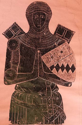
Heraldry was bling, and also subject to the rapid elaboration over those competitive centuries as seen in clothing and armour. A simple coat of arms on a shield may have sufficed in the early 14th century, but these were often depicted in a colouful and blingy way. This battered brass of a knight from Gorleston in Suffolk bears a small shield that has a roughened surface to hold enamels or resins to display the heraldic colours.

This brass from Chesterfield has gone the full monty. Terrible photo, sorry. Because of the way tombs have been messed around over time, sometimes the full heraldic bling is not preserved as it could include arms on the tomb chest, in an archway or above a niche. The whole ensemble is often not in its original condition. Somebody versed in the arcane language of heraldic depiction could tell a whole story of family fortune from the brass above.


A significant bit of knightly bling was the livery collar, becoming apparent during the Wars of the Roses, supposedly to indicate where loyalties lay: SS for Lancaster, suns and roses for York and S with roses for the Tudors to show we are all lovey again. The above examples all come from Harewood church in Yorkshire. If they really show loyalties, this mob did tend to go with the flow. They are sometimes found on female tombs as well, as in the example from Methley above. There is a difficulty in interpreting the significance of these. They are taken to indicate allegiance. In contradictory mode, they are often used for dating, identifying the precise owner of the effigy by the reign of the monarch that they died in. Both cannot be correct. If everyone had been on the side of the current winners, there would have been no war. Perhaps it didn't show so much which side they were actually on, but how their descendants wanted them to be remembered.

They were not all fraught with royal controversy. This example from Ripon in Yorkshire wears a collar depicting a deer within a park, a local badge of the Markenfield family. He evidently preferred to advertise his big fish in a smaller pond status.

Certain styles of bling denoted particular offices. This battered effigy in Eastrington, Yorkshire, wears the robe and coif of a judge over the suit of armour of a knight; not a combination he would have worn in real life. He really wanted to hit the viewer with all his status symbols.

A mayor of Norwich flaunts his fur lined ceremonial robe and beads, significata of office.

If you didn't rate a suit of armour, you could advertise your significance with the size of your purse, as with this civilian tomb in Ashover, Derbyshire. Presumably this was meant to indicate the amount you were prepared to give to charity for the benefit of your immortal soul, but a purse that size is definitely bling. They kind of missed that bit about the camel and the eye of a needle in the middle ages.

Even at slightly less elevated levels of society, a bit of bling denoted special status. This rather lumpy battered effigy from Wadworth, Yorkshire, carries a hunting horn, symbolic of his role as a forester. In less complex tombs, symbols such as swords, chalice and paten, keys, shears and the like serve as a communication system for information about the status of the deceased.

The ultimate bit of swank was if your dog was wearing bling. This fine hunting dog, a status symbol in itself (Hey, you didn't have a dog that could bring down a deer unless you were entitled to hunt the deer.), on a knightly alabaster tomb in Halsham church, Yorkshire, was probably sporting some real bling in his heyday.
In the religious community, clothing and bling had very specific references to the status and function of the wearer, but that is a story for another day.